2018 S/S global color trend was released by WGSN
Orange returns
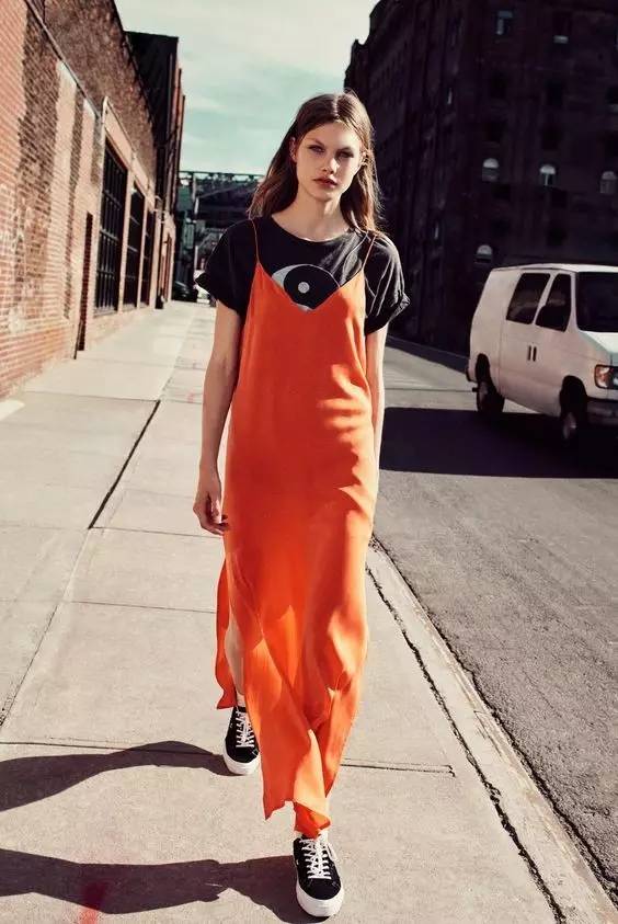
As the important color in 2018 S/S, the orange color is oriented from the recent popular amber and coral colors.
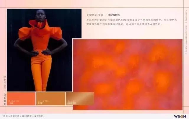
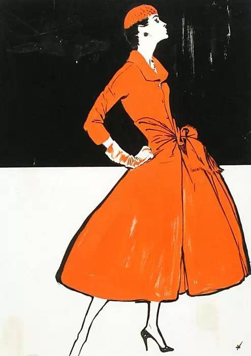
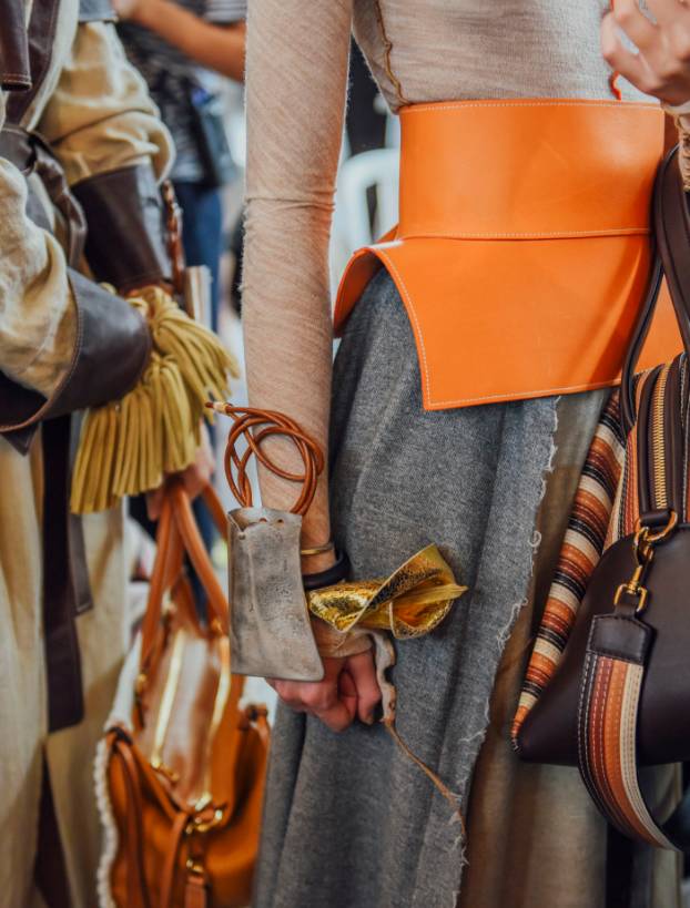
It looks bright and comfortable when white color mixes with orange
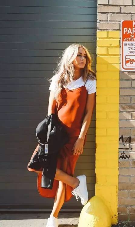
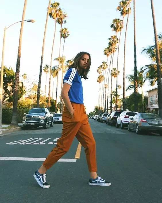
Another cool blue and orange give a most beautiful contrast color. It also gives a strong visual effect.
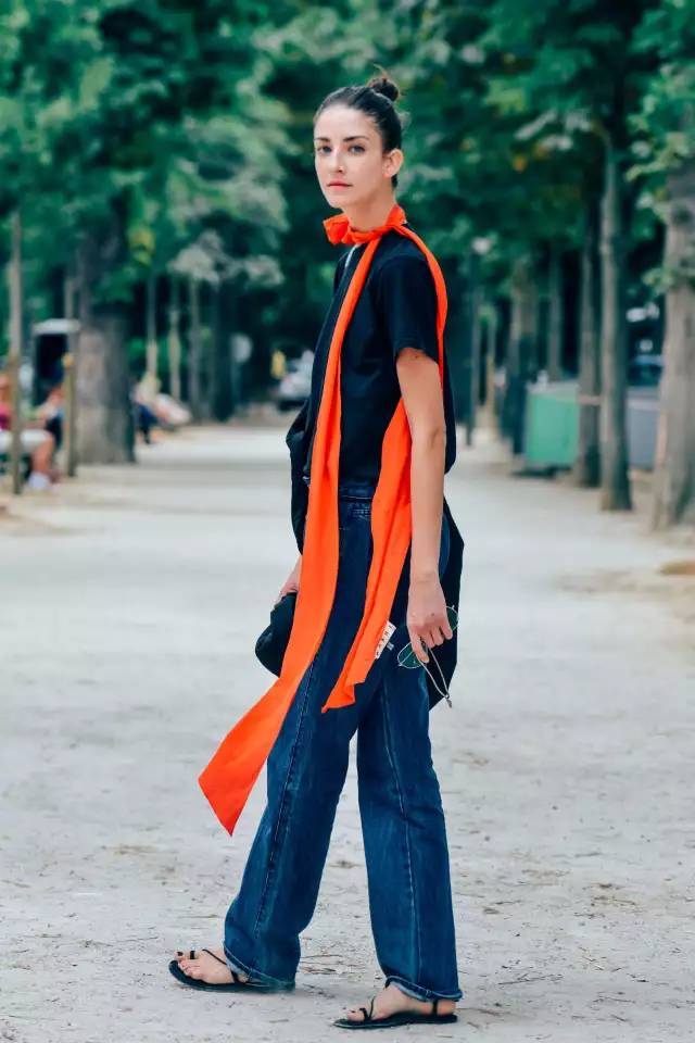
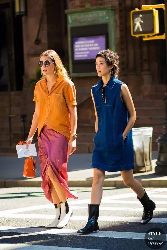
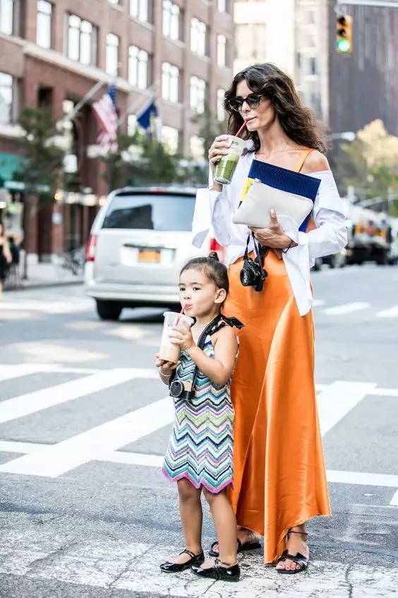
The orange skirt perfectly intermingle feminine and loveliness.
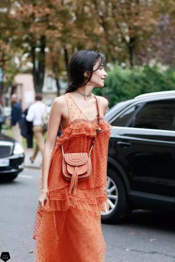
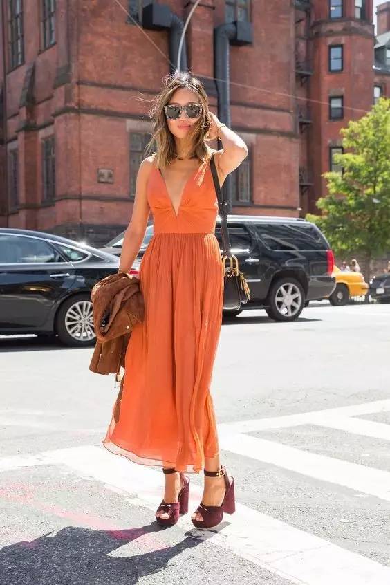
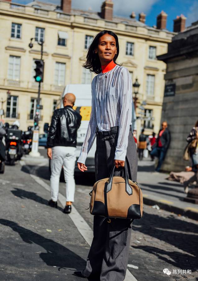
The deepening orange gives maximum warmth and the most active visual effects. This kind of top is more revealing of their fashionable personality
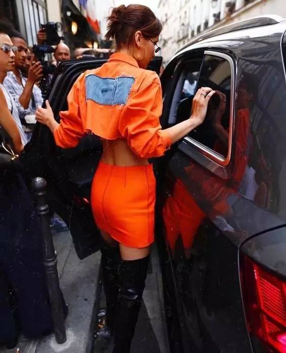
Orange racer skirt with a simple T-shirt is also a good choice! Simple, fashionable, lovely and liberal
Netural color is more luxurious
2018 spring and summer colors reveal gorgeous style. The earth's brown color is close to red, and the beige is close to yellow. These colors meet two tones color trend in this season.
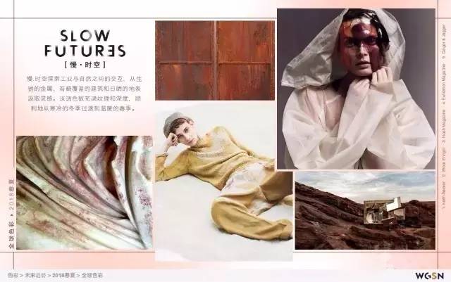
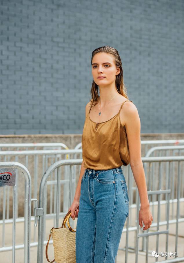
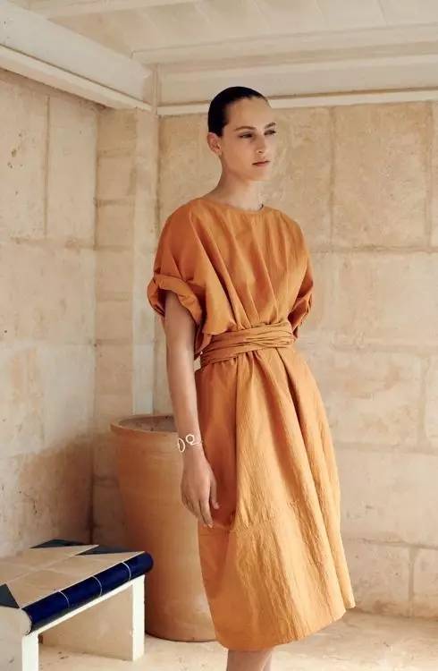
The neutral colors are those with lower saturation. Those dark and grey colors are called neutral color.
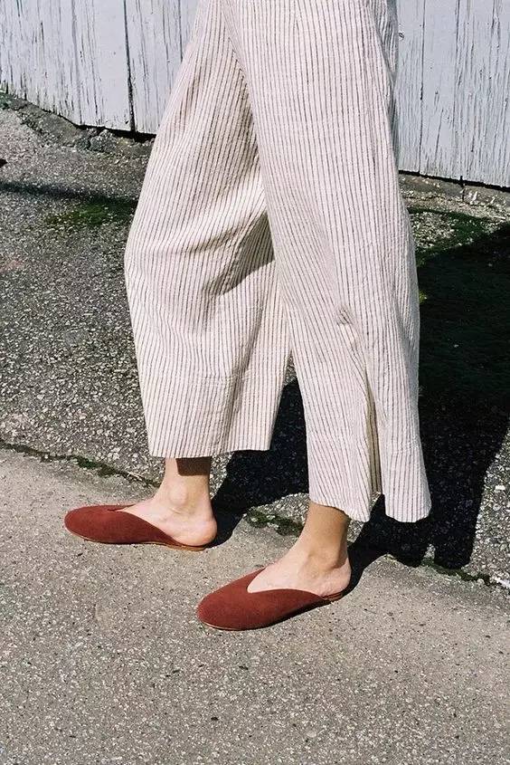
"Neutral color" is a very intellectual color. It plays an important role in color matching.
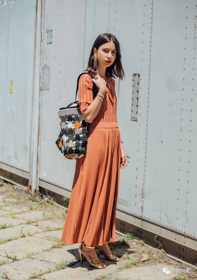
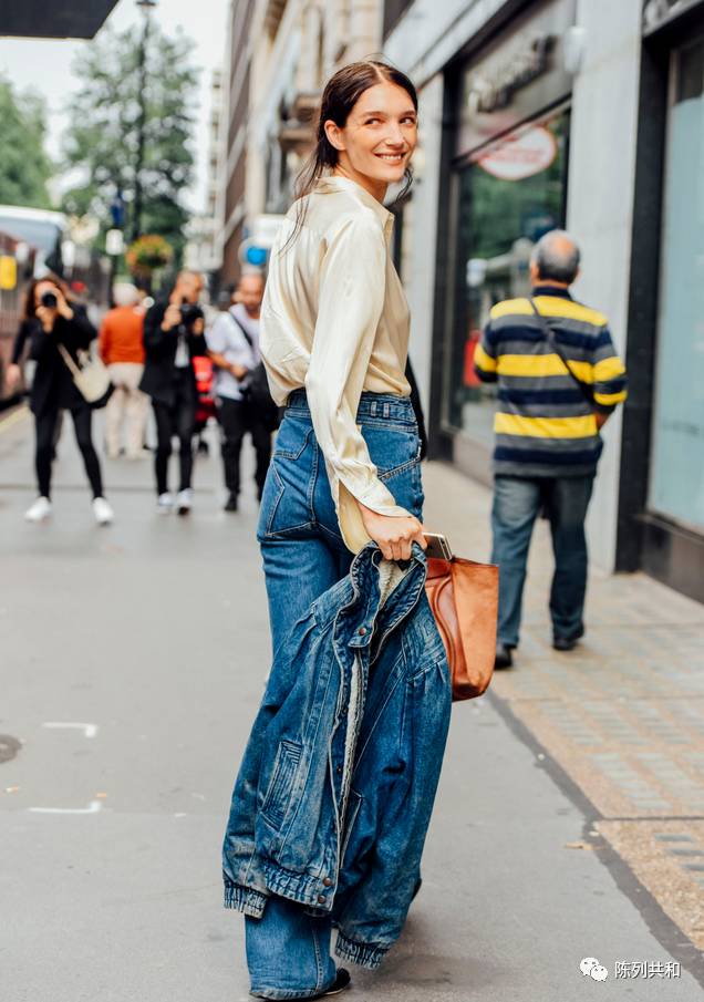
The neutral color saturation is very low, so they are not too eye-catching or too awkward. It gives a fresh and elegant visual feeling, and it is not limited to gender and age.
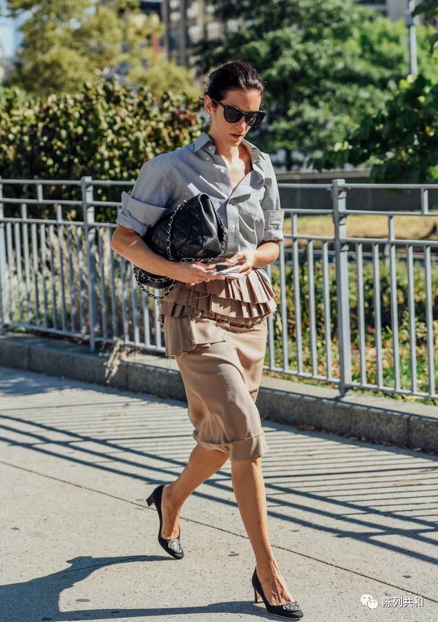
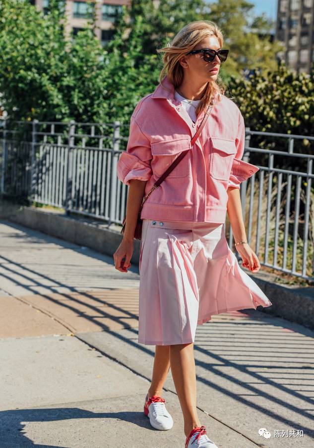
Pink color - glorious infinitely
This color is no longer pale, but presents with bright and luminous effect. It can replace the fluorescent color. The overall color give a sense of romance, and gives a feeling of returning to the age of sixteen. This color should not match the dark colors
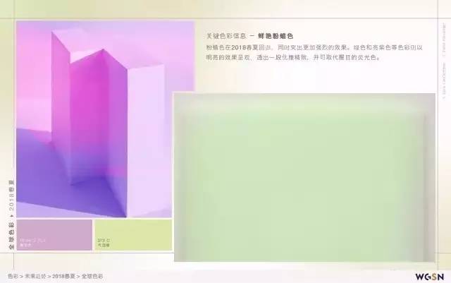
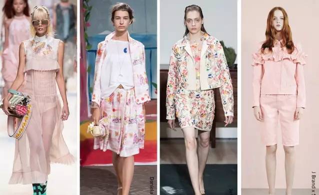
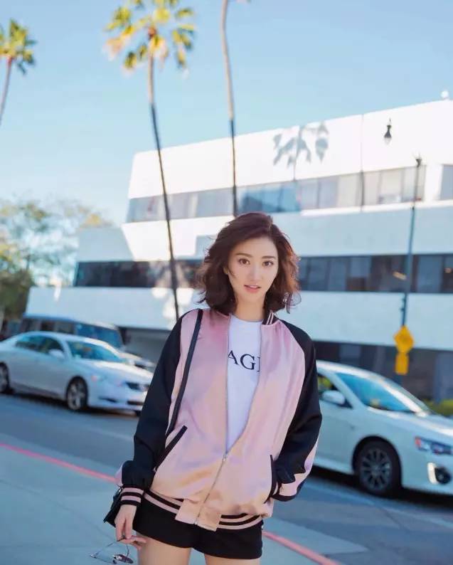
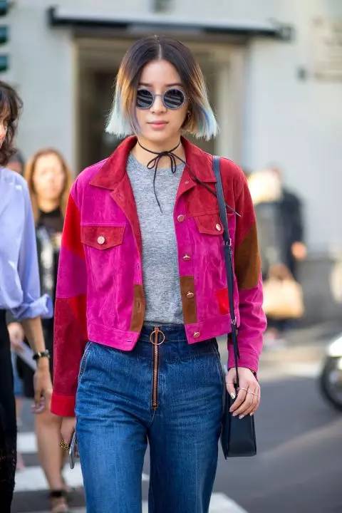
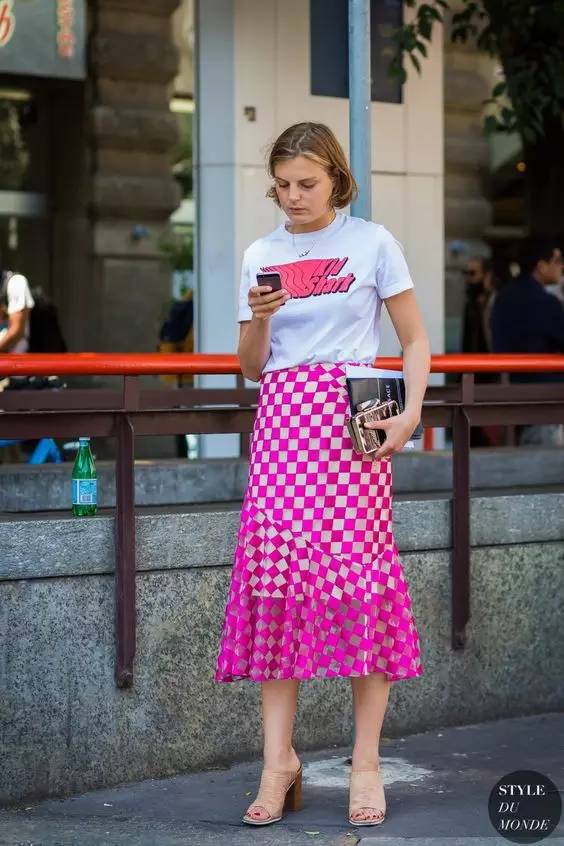
The fabrics shall be delicate, texture, drape, elegant, and high-end etc.
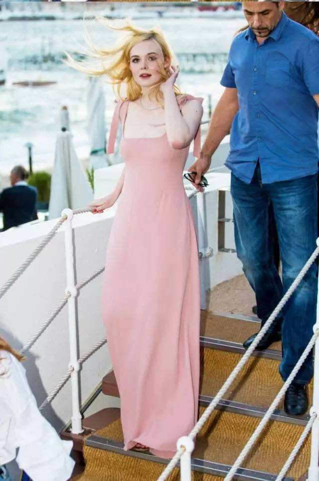
Youth style becomes the key
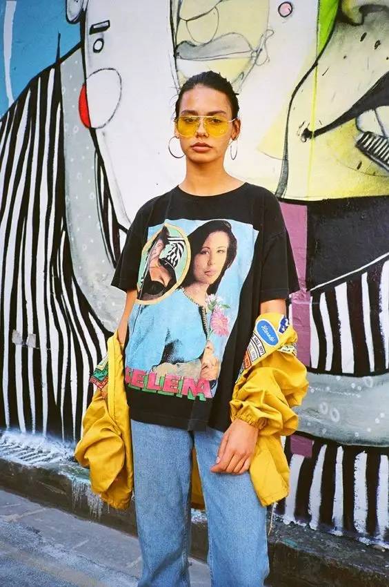
The traditional age concept is weakened and replaced by a young attitude. For color, this trend brings bright colors and rebellious mixes.
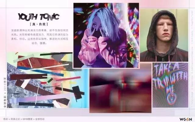
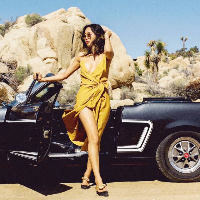
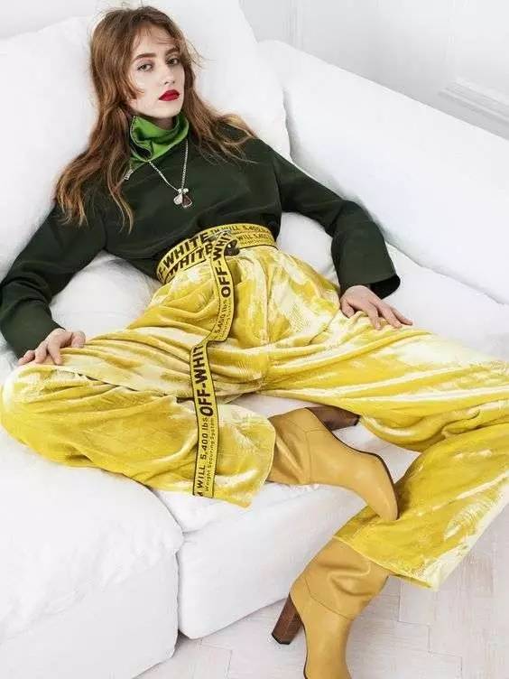
The key to the youth style is a two tone or multicolors matching, and the design is leisure and fashionable.
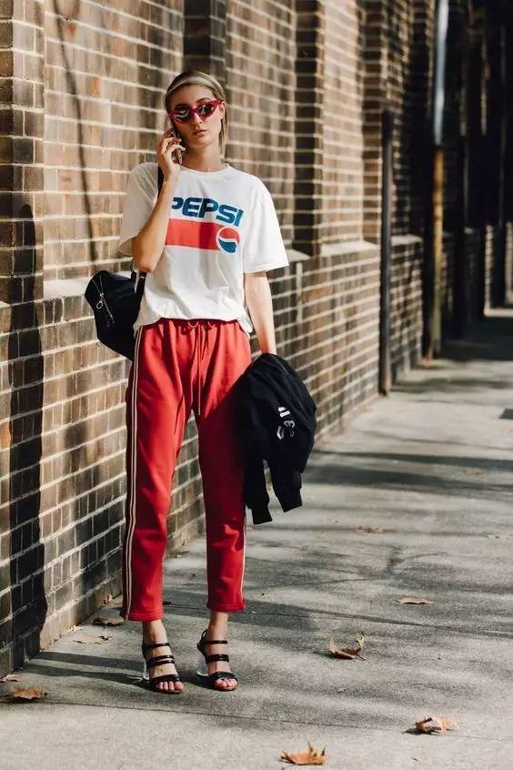
Dark colors are important in summer
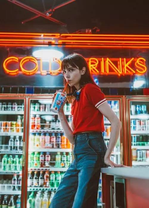
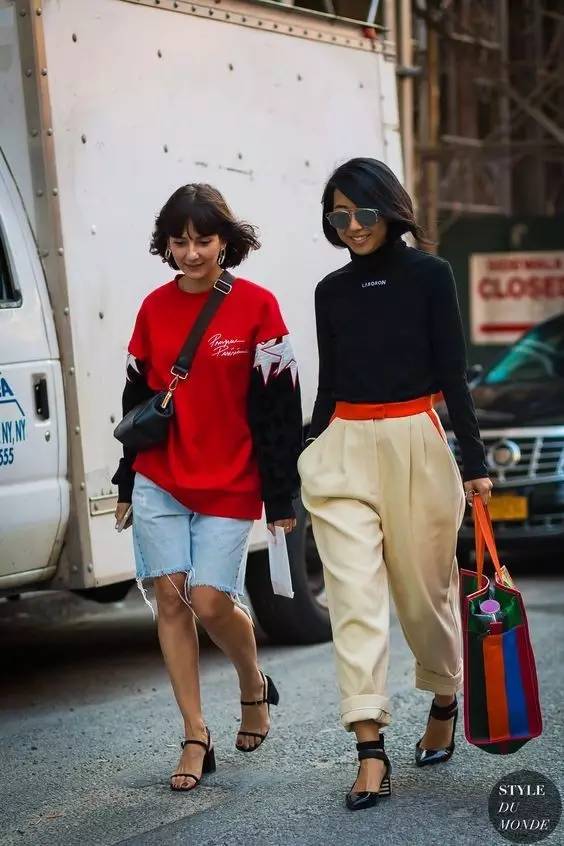
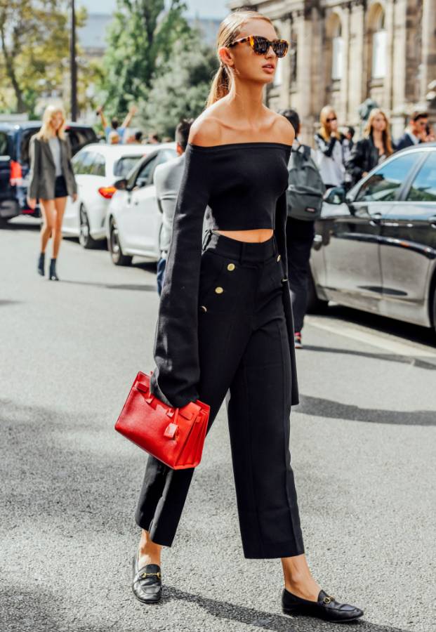
Contrasting colors are the key to the 2018 S/S. Different dark shades and bright colors form complementary and contrasting effects
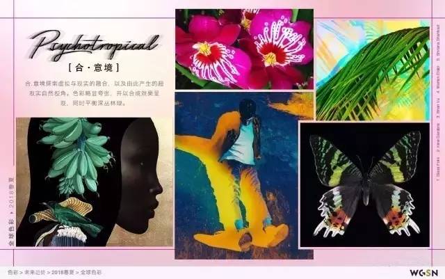
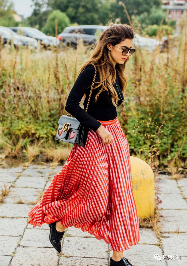
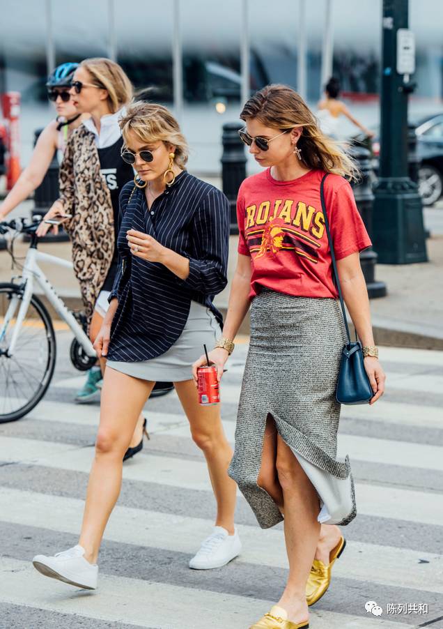
In general, the color matching is divided into two major categories, one is the coordination of color matching, the other is the contrast color matching. There is a big difference between contrasting colors, for example, yellow and blue, red and turquoise, red and yellow, etc.
Although people alwyas say "the trend is elapsing, and the style is forever", it is the changing trends and colors that bring endless freshness to our lives and clothes. Which trend will you fall in love with this time?
